I've built or redesigned more dashboards than I can count at this point — internal admin panels, SaaS analytics screens, operations tools, reporting views. And the pattern I see fail most consistently isn't bad colour choices or ugly typography. It's information density handled without any hierarchy thinking at all.
The request usually sounds reasonable: "Can we put the sales total, active users, pending orders, churn rate, last 30 days chart, top products, recent activity log, and the team performance table all on the home screen?" And technically, yes, you can fit all of that. But fitting it and making it usable are two completely different things.
What follows are 13 patterns I've applied across real projects — some of them obvious, some of them things I only figured out after watching a client stare blankly at a screen I was proud of. These aren't theoretical. They come from actual build-and-iterate cycles on shared cPanel hosting with PHP backends and vanilla JS frontends, where I didn't have the luxury of a massive engineering team to bail out bad UX decisions.
The Patterns
1. Lead with one primary number, not six
Every dashboard should have a single "hero metric" — the one number that answers the question the user came to answer. On an e-commerce admin panel I worked on last year, the client wanted revenue, orders, returns, sessions, conversion rate, and average order value all in a top bar. We stripped it to just revenue for the day with a percentage delta from yesterday. Everything else moved one level down. Time-on-page went up noticeably in the next session recording batch.
2. Use card sizing to communicate importance
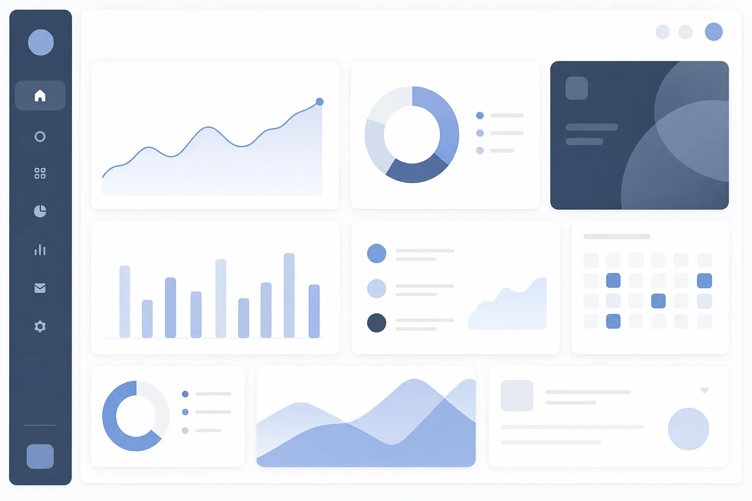
Not all cards should be the same size. A 2-column wide card signals "this matters more" without you ever having to say it. I typically use a 12-column grid and reserve 6-col or 8-col widths for primary metrics, 3-col or 4-col for supporting data. Users pick up on this spatial hierarchy almost instantly, even if they can't articulate it.
3. Group by decision, not by data type
The instinct is to group "all financial metrics together" or "all user metrics together." But users don't think in data categories — they think in decisions. "Do I need to action anything right now?" is a different mental model than "here are all my numbers sorted by theme." Group by the question the data answers, not by the source it came from.
4. Separate alerts from analytics
This one saved a client relationship. The dashboard I inherited had critical alerts (low inventory, failed payments, support tickets over SLA) buried in the same grid as trend charts. Nobody saw them. I pulled alerts into a dedicated strip at the top — styled distinctly, collapsible once reviewed. Analytics stayed below. Suddenly the team started catching issues before customers complained.
5. Use progressive disclosure for detail
Show the summary. Offer the detail on demand. A table with 200 rows does not belong on a dashboard home screen — a summary card that says "47 orders this week — view breakdown" does. The expand or drill-down interaction is not a failure of the dashboard; it's the design working correctly. I've written more about how progressive disclosure can go wrong at the flow level in The Onboarding Flow That Silently Bled Users, and the same principles apply to dashboard information architecture.
6. Anchor time context visibly and consistently
One of the most common sources of user confusion I've encountered: a dashboard where some numbers are "today," some are "this week," and some are "last 30 days" — and none of them say which. Users make incorrect comparisons and then lose trust in the data entirely. Every metric card should either display its time range label directly or inherit it from a clearly visible global date selector. Don't make users guess.
7. Use colour sparingly and with purpose
I used to add colour to make dashboards look "designed." I've since reversed that completely. Now I default to a nearly monochrome layout and reserve colour for three specific uses only: positive delta (green), negative delta or alert (red/amber), and interactive elements (brand colour). When everything is coloured, nothing stands out. The dashboards that look the calmest under data load are the ones that use colour as signal, not decoration. This connects directly to contrast discipline — something I covered in detail in Dark Mode Is Not Just an Invert Filter.
8. Don't default to line charts for everything
Line charts are great for trends over time. They're terrible for comparing categories, showing composition, or displaying a single current value. I've seen dashboards where someone put a line chart for "current plan distribution" (should be a donut or bar), "top 5 products this week" (should be a horizontal bar), and "today's revenue" (should just be a number). Match the chart type to the question being answered, not to what looks impressive in a demo.
9. Reserve the top-left for orientation, not navigation
Users' eyes land top-left first on left-to-right reading interfaces. That prime real estate should orient them — "here's where you are, here's the most important thing happening right now." Navigation (sidebar, breadcrumb, tab bar) handles where they go next. When I've seen navigation items crammed into the top-left of a dashboard canvas itself, users get confused about whether they're looking at the product or a menu for the product.
10. Treat empty and zero states as part of the density design
A dashboard where a card shows "0" with no context is almost as bad as one with too much data — it's noise in a different direction. Zero states need to tell a story: "No orders yet today — yesterday at this time you had 12." Or "No failed payments this week ?." Empty and zero states are not edge cases to style later; they're part of your information hierarchy.
11. Build in a "focus mode" or collapsed view for power users
After a few weeks of using a dashboard, many users mentally stop seeing sections they don't care about. Make that official. Give them a way to collapse, hide, or minimise cards they consistently ignore. In a recent admin panel, I added a simple toggle per card — a small chevron that collapses the card to just its header. Users who wanted everything visible kept it expanded. Users who needed speed collapsed everything except their primary metric. Both groups were happier than when everyone was forced into the same layout.
12. Test density on the smallest screen your users actually use
Dashboard design on a 27-inch monitor lies to you. I've shipped dashboards that looked beautifully balanced on my setup and were completely unusable on the 13-inch laptop the client's ops team actually used. Now I design at 1280px width as my baseline for dashboard layouts, check at 1024px, and add a simplified stacked view for anything below that. It forces prioritisation decisions that make the dashboard better at every size.
13. Audit every metric for a "so what" answer
Before any metric makes it onto a dashboard, I ask: if this number changes by 20%, what does the user do differently? If the answer is "nothing" or "I'm not sure," the metric doesn't belong on the primary view. It can live in a reports section, an export, or a secondary analytics screen — but it's not dashboard material. This single filter has helped me push back on stakeholder requests more confidently than almost any other heuristic I've developed.
Putting This Into Practice
When I approach a dashboard redesign now, I start with a quick audit before I open any design tool. I screenshot the current dashboard, print it (or view it at arm's length on screen), and highlight only the things I can read in the first five seconds. If I can highlight more than three things, the hierarchy isn't working. If I can't highlight anything at all, the density has buried the signal completely.
From there I use patterns 1, 3, and 13 as my first filter — establish the hero metric, group by decision, and kill anything with no actionable "so what." The remaining patterns are refinements applied in context, not a rigid waterfall process.
The honest reality of dashboard design is that the pushback you'll get is almost always from stakeholders who conflate visibility with value. "If it's not on the dashboard, people won't know it exists" is a real argument I've heard multiple times. My counter-argument has evolved to this: if it's buried in visual noise, people also won't know it exists — and worse, they'll stop trusting everything around it.
A dashboard that helps someone make one good decision in 10 seconds is more valuable than one that shows 40 metrics and requires 10 minutes to interpret. That's not a philosophical position — it's something I've seen play out in actual user behaviour, actual support tickets asking "where is X," and actual clients who start ignoring dashboards they asked me to build. The density problem is real, and these 13 patterns are how I keep it from happening again.
Frequently Asked Questions
How do I know if my dashboard has too much information density?
If users regularly ask "where do I find X?" or ignore entire sections, density is probably the culprit. Run a 5-second test: if someone can't tell you the most important number on the screen after five seconds, the hierarchy is broken.
Should I let users customise their dashboard layout?
Yes, but only after you've nailed a sensible default. Customisation is a safety valve, not a substitute for good design decisions. Most users will never touch it — so your default state needs to work for the majority.
What's the biggest mistake designers make with data dashboards?
Treating every metric as equally important. Stakeholders often want everything visible "just in case," but that leads to visual noise where nothing stands out. Your job as a designer is to push back and establish a clear primary action or insight per screen.