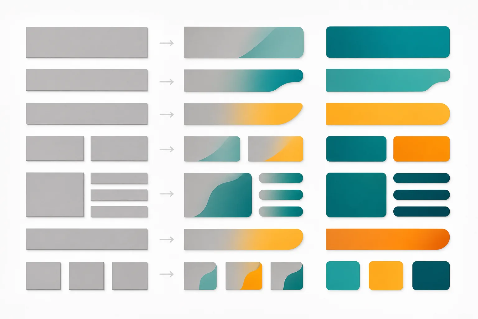
For years, my design mockups had a dirty secret. Every client-facing Figma file I shared was full of either Lorem ipsum — that meaningless Latin filler that design tools autofill — or placeholder content so generic it might as well have been Lorem ipsum. Things like "John Smith, Software Engineer" with a grey avatar circle, product descriptions reading "This is a great product. It has many features. You will love it." I'm cringing as I type this.
The problem wasn't just aesthetic. It was functional. When a client looks at a mockup full of fake filler, they're mentally doing two jobs simultaneously: evaluating the design, and trying to imagine what real content would look like in it. That's cognitive overhead you're forcing onto them, and it consistently produced feedback that missed the point. I'd get comments like "that text looks too long" when the real text would have been shorter, or "the card feels too empty" when real product descriptions would have filled it naturally.
This is a before/after breakdown of how I changed my placeholder content workflow using AI — specifically Claude — and what actually improved as a result.
The Before: What "Good Enough" Placeholder Content Actually Cost Me
My old process for placeholder content was a combination of three bad habits:
- Lorem ipsum from Figma's built-in text fill. Fast, brainless, totally useless for communicating design intent.
- Manually writing generic content. I'd spend 20–30 minutes writing fake product names, bios, and descriptions that were "realistic enough." They weren't, because I was writing them in isolation without any user or product context.
- Copying real content from similar live products. This sounds better but it introduces its own mess — licensing grey areas, content that doesn't fit the actual product's tone, and clients who recognise competitor copy and get distracted by it.
On a project last year — a B2B SaaS dashboard for a logistics company — I shipped a round of mockups to the client using manually written placeholder content. The user profile cards had names like "Admin User" and "Test Account." The data table had row values like "Item 001," "Item 002." The notification feed said things like "Your shipment has been updated."
The client's feedback round took three sessions to get through because half the comments weren't about the design at all. They were about content they were mentally filling in themselves, incorrectly. We lost two weeks of alignment time because the mockups weren't communicating what the real product would feel like.
That was the moment I decided the placeholder content problem was worth solving properly.
The After: Building a Realistic Content Generation Workflow with Claude
The shift wasn't just "use AI to write placeholder text." That alone wouldn't fix anything — if you just ask Claude "write me some placeholder names and descriptions," you'll get output that's barely better than what you'd write manually. The real change was treating placeholder content generation as a design activity that required the same context-setting as any other design decision.
Step 1: Write a Content Context Brief Before Touching the AI
Before I open Claude, I now write a short brief — usually just a paragraph or two — that defines:
- What the product is and who uses it
- The tone of voice (formal, conversational, technical, warm)
- The user persona whose data I'm mocking (job title, industry, behaviour)
- The specific UI component I'm generating content for
- Any constraints (character limits, data format requirements)
For the logistics SaaS project, that brief would have looked something like: "B2B logistics platform used by warehouse operations managers in mid-sized e-commerce companies. Tone is professional and functional — no marketing fluff. Persona: Budi, 34, Operations Manager at a Jakarta-based 3PL. I need 8 realistic shipment notification messages for a notification feed component, each under 80 characters, written as system events."
That brief changes everything. Claude doesn't have to guess at tone, persona, or format. You're not hoping it produces something usable — you're directing it toward a specific output.
Step 2: Structure Your Prompts Around Components, Not Pages
One mistake I made early on was prompting AI for an entire page's worth of content at once. "Generate all the content for a dashboard homepage." The output was all over the place — inconsistent tone, wildly varying lengths, no sense of hierarchy.
Now I prompt component by component. A data table needs different content generation logic than a user profile card, which needs different logic than an activity feed. Each component prompt specifies:
- The data type and field names
- How many rows or items I need
- The realistic range of values (e.g., shipment weights between 2kg and 500kg, not "some weight")
- Any relationships between fields that need to stay internally consistent
That last point is huge. I used to have placeholder data tables where the "date created" was newer than the "date modified." Or user profiles where someone with a "Junior" title had 15 years of listed experience. Claude, when properly prompted, maintains internal consistency across a dataset in a way I simply couldn't be bothered to do manually.
Here's a simplified version of the prompt structure I now use for table data:
Generate 10 rows of realistic shipment data for a logistics dashboard.
Fields: shipment_id (format: SHP-XXXXX), origin_city, destination_city,
weight_kg (range: 5–200), status (one of: In Transit, Delivered, Delayed,
Pending Pickup), created_date (within last 30 days), estimated_delivery
(3–7 days after created_date).

All cities should be real Indonesian cities. Delayed shipments should
have an estimated_delivery that has already passed. Return as a JSON array.
That last instruction — "return as a JSON array" — means I can paste it directly into my prototype or into a Figma plugin that reads JSON for table population. No reformatting required.
Step 3: Generate Persona-Consistent Microcopy, Not Just Data
Data tables are relatively easy. The harder win came from using this approach for UI microcopy — the small contextual strings that make a UI feel real. Error messages, empty state descriptions, notification copy, confirmation dialog text, tooltip labels.
Before, I'd write these as I went: "No items found." "An error occurred." "Are you sure?" Generic, forgettable, and completely disconnected from the product's actual tone.
Now I batch-generate these with Claude as a dedicated step. For the logistics platform, I prompted for 15 empty state messages across different sections of the app, specified that the tone should be "operational and helpful, not cute or playful," and asked that each message include a primary message under 8 words and a supporting subtext under 20 words.
The output was immediately usable in mockups. More importantly, it read like the product. Clients reviewing the mockups stopped commenting on the text being fake — which means they were reading it naturally and focusing on the design decisions instead. That's exactly what placeholder content is supposed to do.
Step 4: Maintain a Content Library Across a Project
One thing I didn't anticipate: consistency across screens becomes a real problem if you're generating content piecemeal. If you generate user names for a dashboard and then separately generate user names for a settings screen, you'll end up with different fictional users in different parts of the same product — which looks sloppy and confuses clients.
I now keep a running Notion page (or a simple text file, whatever) called the "Placeholder Content Library" for each project. Every time I generate a set of placeholder content with Claude, it goes in there — tagged by component type. Before generating new content for a new screen, I paste the relevant existing content into the prompt context and ask Claude to extend or stay consistent with it.
It adds maybe five minutes to the process and eliminates a category of review feedback I used to get constantly: "Wait, who is this? I thought the user was named Budi?" It sounds trivial but in detailed client reviews, these small inconsistencies erode trust in the mockup's fidelity.
The Measurable Difference
I want to be honest: I haven't run a controlled A/B test on client review quality. What I have is a clear before/after sense from projects where I used this workflow versus projects where I didn't.
The most concrete improvement: first-round client feedback rounds are noticeably more focused. Before, I'd routinely get 30–40% of feedback comments that were about content rather than design. With realistic AI-generated placeholder content, that drops to maybe 5–10% — and most of those comments are useful ones, like "we wouldn't actually use that status label in our system."
The workflow also changed how I present mockups internally. I'm more confident sharing work-in-progress screens because they look considered even when the design itself isn't finished. A screen with realistic data and microcopy reads as "in progress, coherent vision" rather than "half-built placeholder dump."
There's also a subtler design benefit I didn't expect. When you're looking at realistic placeholder content in your own mockups, you catch layout problems faster. A product name that's genuinely 47 characters long breaks your card layout in ways "Product Name Here" never would. Real-feeling notification copy reveals truncation issues. Realistic Indonesian city names expose encoding edge cases in fonts I wouldn't have caught until later.
It's a feedback loop that makes your design more robust before it ever reaches a user — which is exactly what good tooling should do. If you're interested in how AI output quality connects to what I actually ship, my post on using Claude to audit my own AI outputs covers the other side of this equation — when to trust what the AI gives you and when to verify it.
What Didn't Work (Honest Tradeoffs)
Not everything about this workflow is smooth. A few honest failure points:
- Domain-specific technical content is unreliable. If your product is in a niche technical domain — medical records, financial instruments, specialised legal terminology — Claude will generate content that looks plausible but contains domain errors a subject-matter expert will immediately flag. I learned this on a healthcare-adjacent project. Always have a domain expert sanity-check your placeholder content in these cases.
- The JSON output is usually 90% correct, not 100%. I've had Claude generate JSON with trailing commas, mismatched quote styles, or occasional hallucinated field names. I run every JSON output through a validator before pasting it anywhere. It takes 10 seconds and has saved me from broken Figma plugin states more than once.
- Clients sometimes think it's real. This is a genuine UX trust problem. A convincing placeholder that includes realistic company names, realistic prices, and realistic dates has fooled clients into thinking they're looking at live data. I now explicitly label all placeholder content in the Figma frame and call it out verbally in every review session.
Practical Takeaways
- Write a content context brief before prompting — tone, persona, product, and format constraints up front.
- Prompt per component, not per page. Each UI component has different content logic.
- Ask for JSON output when the content is structured data. It pipes directly into prototyping tools.
- Maintain a project-level placeholder content library to keep personas and data consistent across screens.
- Always validate AI-generated JSON before using it. Run it through jsonlint.com or your editor's formatter.
- Label placeholder content visibly in client-facing files. A convincing placeholder that gets mistaken for final copy creates alignment problems you'll have to undo.
The Lorem ipsum era should be over. Not because AI-generated content is perfect — it isn't — but because the gap between what you can generate in ten minutes with a well-crafted prompt and what you could write manually in an hour is now significant enough that there's no good reason not to close it. Your mockups will communicate better, your clients will review more usefully, and you'll catch layout and truncation issues weeks earlier. That's not a marginal improvement. That's a different quality of design process.
Frequently Asked Questions
Is AI-generated placeholder content good enough to ship to production?
No — it's a design and presentation tool, not final copy. Use it to validate layout, tone, and hierarchy during reviews, then replace it with real content before launch. Treat it as a highly informed stand-in, not a finished product.
Which AI model is best for generating realistic placeholder content?
Claude is my go-to because it follows structured prompts reliably and handles tone constraints well, but GPT-4o works well too. The model matters less than the quality of your prompt — if you don't give it context about your user, product, and tone, any model will produce generic filler that's barely better than Lorem ipsum.
Does realistic placeholder content ever mislead clients into thinking copy is finalised?
Yes, and this is a real risk. I now always add a visible "PLACEHOLDER — NOT FINAL COPY" label in Figma frames when sharing mockups with clients, and I mention it explicitly in the handoff notes. A convincing placeholder can accidentally set expectations you'll have to undo later.